Monday, 27 December 2010
Design for screen - T-mobile
the song gets stuck in your head but the advert its shocking to begin with as we expect the man to hit the ground hard and it gives a feeling of wonder and envy as you want to experience what it would be like if the world was that mouldable.
Sunday, 26 December 2010
Design for screen - post-it notes animations
http://www.youtube.com/watch?v=EZTL0EKrKRM&NR=1&feature=fvwp
http://www.youtube.com/watch?v=-ZtxHOfmhH4&NR=1&feature=fvwp
http://www.youtube.com/watch?v=Y1rZqw5bXb4
this video is from the same guys who made the coke and mentos routine which became one of the the worlds most popular viral adds, its simple and brilliant and really shows how you can take something relatively uninteresting and make it exciting and inspirational. This is the kind of aspect I would like my own work to have, using simplicity or simple things and doing something new with them or reinventing the capabilities and uses they already posses.
Friday, 24 December 2010
Design for screen - Illustrations 2
The Carphone Warehouse used a series of animations which used whiteboards and board pens which could quickly and easily rub out and adjust. Highly effective and easy to try out you just need patience.
a history of communication.
Speak no mobile. See no mobile. Hear no mobile.
a history of communication.
Speak no mobile. See no mobile. Hear no mobile.
Tuesday, 21 December 2010
design for screen - Xbox
http://www.youtube.com/watch?v=XFQWSu9QWMc&feature=related
brilliant and quick advert for the Xbox 360 which took 3 years to make its no wonder the director on the making of video is a bit deranged. Its interesting that company which is selling computer animated video games is using a method to promote its products that doesn't involve computer animation, it in some sense broadens the horizons for the audience as to what the console in terms of entertainment as the advert is entertaining in itself to watch.
http://www.youtube.com/watch?v=YNudcX_uUwM&feature=related
Friday, 17 December 2010
Design for screen - PES
PES make loads of quirky and almost pointless stop motion and moving image videos, they all seem to have a jokey attitude to them whilst remaining original and innovative.
Wednesday, 15 December 2010
Martin Creed
http://www.martincreed.com/works/index.html
Martin Creeds work i really simple and easy when you look at it and people may be quite dismissive with it but in its own right its show what can be down with the simplest, most basic idea. For example he sent a piece of A4 paper scrunched up into a ball to the Tate Modern and it became a work of art, so what would seem to be a piece of rubbish and a prank/piss take bit of mail has become something else much bigger its now given credit at the obvious idea however annoying people may find it.


Martin Creeds work i really simple and easy when you look at it and people may be quite dismissive with it but in its own right its show what can be down with the simplest, most basic idea. For example he sent a piece of A4 paper scrunched up into a ball to the Tate Modern and it became a work of art, so what would seem to be a piece of rubbish and a prank/piss take bit of mail has become something else much bigger its now given credit at the obvious idea however annoying people may find it.
Monday, 29 November 2010
What is research - part 1
START ANYWHERE!
- Don't research in hindsight research in foresight trying to move forward
- Research (aka source material)
- Systematic approach
- subjects
- collection and modification
- primary and secondary
- Characteristics and means of expression
- structure and restructure
- enlarge and reduce
- combine and extract
- Martin Venesky - "Design doesn't straighten and clarify the world, it reflects the world as it ventures beyond problem solving in process, experiment and discovery."
Fail. Fail Again. Fail Better.
- get good at failing - record it / document it / evaluate it / learn from it
- E.G. - Alexander Fleming - discovered penicillin by accident in 1928
- Research is a human activity based on intellectual investigation and is aimed at discovering, interpreting and revising human knowledge on different aspects of the world.
- The information you require dictates how you collect it - if you interview someone you would record what they say not take a picture of them equally if you were recording what they looked like you would in fact take a picture.
- Research is done by what is already known. If something wasn't there or known about we wouldn't ask questions about it as we're ignorant of its existence or lack of existence.
- Facts lead to knowledge - read your facts
- What do you already know?
- What can you find out?
- What can you learn from it?
- How can you develop it?
'WHAT IF...?' and 'WHY?' the biggest questions since 'What is the meaning of life?'
KNOWLEDGE IS POWER
- Types of research
- Primary
- research generated for a specific problem
- research hasn't existed before and hasn't been used for the purpose your looking for before
- e.g. talking to people, asking questions, raw collection, photographs
- Secondary
- published information or material that has been collected for some other pupose than the current study
- analysis and information already exists in conjunction with another topic or aim
- e.g. statistics, facts, area maps, information leaflets/booklets, books, internet images, websites
Sunday, 28 November 2010
Monday, 22 November 2010
Sunday, 21 November 2010
Joe Gonzalez
Joe Gonzalez did this amazing series of vectored compositions for his son Meryck each one was based around a letter of his name. The use of colours and the layering to the whole image in each one really caught my attention and it really inspired me when i first saw them, so much so that i did an entire project based on creating design influenced by him for promotional materials for an exhibition of his work.
http://allmightys.com/store/designers/joe_gonzalez/index.htm
the rest of his designs are on this link.


As well as this series his done many other T shirt designs that have won competitions one of which was used as the front cover of this book below.

http://allmightys.com/store/designers/joe_gonzalez/index.htm
the rest of his designs are on this link.
As well as this series his done many other T shirt designs that have won competitions one of which was used as the front cover of this book below.
Gary Taxali
http://www.garytaxali.com/home.php check out his website theres so much more.
Gary Taxali has to be one of my favourite illustrators, he has this unique style of communication and he has applied his work to many different projects and it features on lots of scales. His work is really pleasing on the eye and has lots of humour and quirkiness about it. each image he makes seems to tell a little story and you become engaged in the role of each character. i especially like the backgrounds he works on as most are just found bits of board or paper or even the inside of book covers and cloth thats been salvaged from an old cushion. It's almost as if he doesn't mind what he works on but each time in gives the image a unique aesthetic.
![]()
![]()
![]()
![]()


Gary Taxali has to be one of my favourite illustrators, he has this unique style of communication and he has applied his work to many different projects and it features on lots of scales. His work is really pleasing on the eye and has lots of humour and quirkiness about it. each image he makes seems to tell a little story and you become engaged in the role of each character. i especially like the backgrounds he works on as most are just found bits of board or paper or even the inside of book covers and cloth thats been salvaged from an old cushion. It's almost as if he doesn't mind what he works on but each time in gives the image a unique aesthetic.
Justin Bua
Justin Bua is an artist who was born in Brooklyn, New York i studied him extensively for my A Level final exam and became familiar with his style and works he has since then influenced and changed the way i draw and the way i look at a subject when I'm drawing. His work is highly influenced by the hip hop and B boy scene that was going on when he was young and growing up and what i find most interesting about his work is the fact that the characters he draws are actual people and this is merely the way he sees them. He has worked on projects such as designing a pair of Limited edition PF Flyers, producing a Slum Village video (Tainted) as well as doing graphics for video games such as NBA and NFL Street. He currently teaches drawing at USC.


| If you like his work you should have a look at one of his books my favourite is this one call 'The Beat of Urban Art' is a nice read and theres loads of brilliant drawings and a few paintings. |


posters and flyers i like
These are just some posters that are on my walls at the moment I've learnt its always easy to keep your creative flow if you surround yourself with visual inspiration.
Red Marketing
http://www.redcmarketing.net/blog/
Adrian Rowe Managing Director
"I don’t believe in the ‘lapdog mentality’ that pervades many agencies. Agencies that tell clients what they want to hear. The role of a good agency is to ‘stand outside’ the client environment, get under the skin of the customers and the products, and make recommendations that will improve commercial performance.
I am convinced that the best model for a marketing agency combines creative excellence with strategic nous in equal measure. Pragmatic, approachable and commercially savvy, Red C has grown into a client focused agency that concentrates first on delivering business growth and profits for its clients, and I am intensely proud of this."
Saturday, 20 November 2010
Visual language - Series.
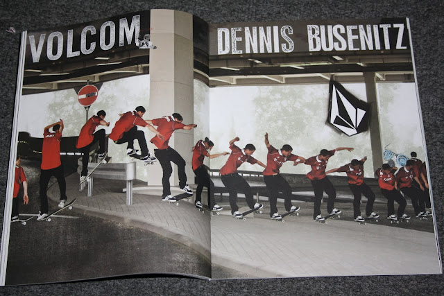
These are examples of work that is in series or sequence. I found them in an old magazine called +1 (issue 8). They are typically used to advertise skateboarding clothes brands and I think they target their audience really well, its straight forward and appealing to them keeping their interest with the live photo sequence.
 |
| Matix Clothing. |
 |
| Volcom Skateboarding brand. |
Tuesday, 9 November 2010
Subscribe to:
Comments (Atom)


