The task definitions resource has provided many points on packaging and promotion to inform my investigation.
Packaging is the science, art, and technology of enclosing or protecting products for distribution, storage, sale, and use.
Packaging contains, protects, preserves, transports, informs, and sells.
Packaging also refers to the process of design, evaluation, and production of packages.
Promotion is the communication link between sellers and buyers for the purpose of influencing, informing, or persuading a potential buyer's purchasing decision.
(Boxes on shelves, things we wear, things we hold while using something, point of sale units, banners, floor graphics,& more….)
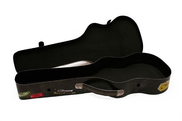
Looking through some of the websites given in the resources (http://www.cardmasters.co.uk/product/presentation-packaging/) I found this one page of design work on Presentation Packaging. The thing that caught my eye was this design of a printed card guitar case as ukuleles are my chosen topic for my 'Good is...!' studio brief.
There was little on the webpage about the design itself but it did draw up a point that the design of the packaging and the success of the contents being consumed can depend a lot on presentation. I'm not really impressed by this design on the guitar case but I did find more examples on the same webpage that I found more inspiring and engaging.
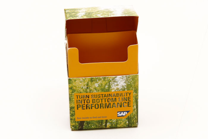
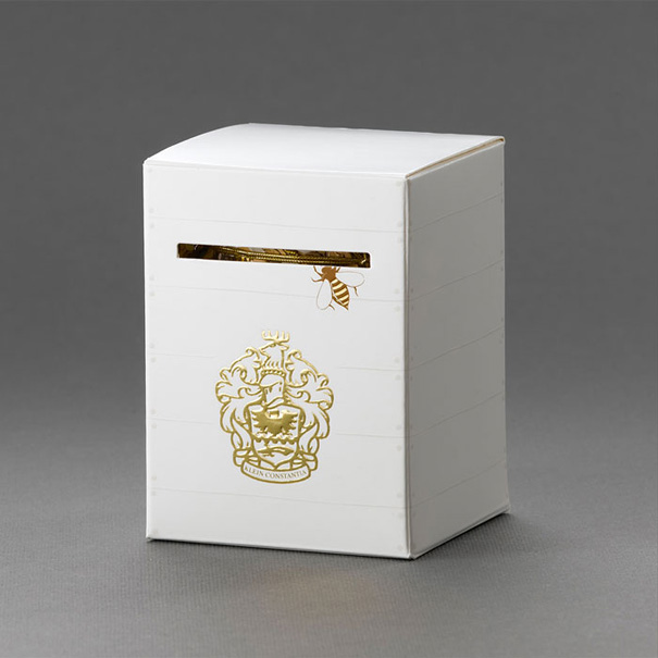
These designs I find more interesting because of the interaction and the relationship between the design on the package and the context of the product or content.
This website focuses on the statistics that people are more responsive if they are engaged by designs, mail shots and other promotional materials if they have some form of interaction, surprise or novel quality.
It also provides instructions on how to make the packaging which will be really useful for future designs and reference.
Bored Panda has always been a good source of a broad range of creative designs and i draw lots of inspiration from their findings. These packaging ideas are brilliant and they give the audience something that already exists but presenting it in a new and refreshing way.
I took a look at a few of the designers and agencies that were featured on Bored Panda to see what other work they have done.
JJAAKK Is an independent design agency that strives to make their works bold, fun and most of all smart.
These designs are nice simple and fun, they do the job well although I noticed that there was no evidence on the package as to what the ingredients are or the cost of the product etc. I really appreciate the idea that a design can transform in some way due to the way it is opened by the audience, this is something I would like to investigate in my own work if I am to produce packaging and promotional materials in response to my 'Good is...!' brief.